 |
Man on Fire by
Luis Jimenez is created through casting. Luis Jimenez likes to create
his artwork through casting because he wants to create an “American
art” using materials that come from his time. Man on Fire is
made of fiberglass and was created to demonstrate himself because his
audiences considered his work to be on fire. The concepts behind his
work are the current symbols of America. He wanted to create pieces
that were important to American society and the country as a whole.
Man on Fire is a little different because it talks about
himself as an artist, but his other pieces of art were created to
demonstrate his idea of what was important to America.
|
Tuesday, July 9, 2013
Casting
Carving
 |
Michelangelo's
Pieta demonstrates the medium called carving. He starts with
a slab of stone, and carves a sculpture into it. This way, he is
breaking away all of the excess stone that is not needed in order to
create the sculpture. The bottom of Pieta shows the size of
the original slab of stone. The reason that Michelangelo carves
statues is to see what secret the rock holds. He believed that each
stone decided what would come out of it.
|
Low Relief Sculpture
 |
King Sahure and a Nome God was
created by the Egyptians between 2458 and 2446 B.C. It
is an example of a low relief sculpture. In ancient Egypt, people
would have sculptures made of themselves with Gods and Goddesses or
other people of importance to them. They did this in order to show
themselves as an independent spirit or a ka in
the afterlife. Having the sculpture buried with them was a sign of
their immortality. King Sahure is placed next to a Nome God because
that was the God that he prayed to the most. He felt connected to
the God and wanted him placed next to his ka.
|
Manipulated Photography
 |
Jerry
N. Uelsmann's Rumples Market
demonstrates the medium of manipulated photography. In order to
complete manipulated photography, Uelsmann takes pictures of multiple
different objects and whites out the background behind these objects.
He then combines the objects into one final picture to show what he
is trying to portray. In Rumples Market
he has used random objects such as the arrows on the street, and the
pictures of Coke bottles to create a face on the brick wall and
street. The whole reason he takes pictures is because he likes to
explore. Where ever he is, if he likes what he sees, then he takes
the picture. The concepts take place in the darkroom. He believes
that is where the art blossoms because it's all based off of what he
can create. In Rumples Market each
portion of the face was taken in a different area. He then combined
them all in the darkroom to create a final portrait.
|
Portrait Photography
 |
Annie
Leibovitz creates art through portrait photography. Her portrait of
Bob Dylan, Los Angles, shows
Bob Dylan making a face at the camera. The white backdrop offsets
his skin and hair color. She tries to photograph the spirit of her
subject. Looking at this picture, it looks as if Bob Dylan is trying
to be funny. By photographing him making a funny face, she has
captured that emotion. Her concept is the ability to photograph the
personality of the public figure that isn't always seen by the press.
In other words, she tries to capture their private life and
personality.
|
Instant Collage
 |
Walker Evans portrays Instant College
through his piece called A Miner's Home Vicinity Morgantown, West
Virginia. He created a new way
to take photographs called a calotype. In other words, Walker Evans
printed pictures from the negative. His medium of choice was instant
collage. He believed that the idea of capturing a picture was an
instant collage. Walker Evans enjoyed capturing pictures of “real
America”. This was the concept and context of his instant
collages. This is shown through his artwork A Miner's Home
Vicinity Morgantown, West Virginia.
It captures the true image of a miner's home.
|
Friday, July 5, 2013
Woodcut
 |
The medium of Tropical Sun by
Emil Nolde is ink. Tropical Sun
is an example of a woodcut, which means, the artist carves out some
of the wood so that only the raised pieces will have ink on them.
The ink is thick and sticky so that it will not flow into the cutout
areas of the wood. Tropical Sun shows
this idea because each color has it's own place on the picture. They
don't intersect or blend like a painting would. Emil
Nolde's career was a huge mark on the German Expressionism time
period. His considered his work experimental but brought to life
many moral dilemmas of the first generation German Modernists. The
context of his work focused around the concepts of moral dilemmas.
|
Collage
_Bridal_Spell.png) |
Jess (Collins)
creates collages and above is an example called Bridal Spell. The
medium for a collage is glue. A collage is put together with
anything that is flat and of the natural element. Some examples
would be a printed object from a magazine or the computer, or a
fabric of some sorts. The artist then glues the objects onto the
paper that they are using. Bridal Spell shows different
people pasted all over her picture. Each one sticks out because they
looks different from the person next to them. Jess Collins was
originally a chemist that became an artist after he had a dream about
the end of the world. This is what influenced his artwork because he
gets his pictures for his collages from children's books and science
textbooks. Each collage is based off of different science ideas such
as density and seamlessness.
|
Oil Paint
 |
Jackson Pollock's
artwork called Circle is an oil painting. The medium of the
painting is oil paint. It can be combined with different colors on
the canvas to create different shades and hues. You can see the
combinations by looking at the many different shades in each color.
They fade in and out from dark to light. For example, the green
outside circle goes from dark green to light green and back again.
Jackson Pollock's artwork was strongly influenced by nature and his
farmhouse in Guggenheim. He converted the barn into a studio and let
the nature flow through him onto the paper.
|
Encaustic
 |
The medium of False
Start by Jasper Johns is made by combining color with hot wax.
This medium is hard to use because the artist needs to create the
painting before the hot wax cools. In other words, they need to work
quickly. The words written within False Start show how
quickly Jasper Johns needed to work because he used a stencil to
write them in. Jasper Johns began doing encaustic paintings because
he found them extremely interesting. He liked the idea of being able
to experiment and then repeat the idea over and over again.
|
Wood Engraving
 |
Albrecht Durer's
Knight, Death, and the Devil was created using the grainy side
of a piece of wood. Hatching is used to carve a design into the
wood. Because they use the grainy side of the wood, wood engraving
can become extremely delicate and detailed. Knight, Death, and
the Devil prove this through the individual hairs that you can
see on the horse and the branches on the trees in the background.
Italy had a huge impact on Albrecht Durer's work. He liked to
include the Italian culture and heritage into his artwork. He
especially liked using the Italian colors and designs. His concept
and context was all about the country of Italy.
|
Etching
 |
The Hundred Guilder Print by
Rembrandt Van Rijn has a medium of ground and an etching pencil. A
ground is an acid- resistant substance. Depending on how hard the
ground is, some artists can use their finger as their etching pencil.
After the artists draws their idea on the paper, it is placed in an
acid bath. The areas that have been drawn are eaten by the acid
which makes them etched into the paper. The Hundred
Guilder Print shows the details
of an etching. You can see the folds of each person's clothing
within the picture. Rembrandt
Van Rijn used his family issues and losses as his reason to create.
Losing most of his family forced him into his work which is when he
created his most famous pieces.
|
Saturday, June 29, 2013
Scale and Proportion
 |
Scale
is used to depict an object from the size of an original object. The
object in a painting can be bigger or smaller than the original
object by using scale. Proportion includes the object and it's
surroundings. Katsuskika Hokusai used both scale and proportion in
his artwork From the Illustrations to 100 poems by 100
poets. The boat is seen as the
main focal point of the painting. However, if you look in the
background, you see hills and houses. In real life, a boat is not
bigger than a grouping of hills or a house. Hokusai used scale and
proportion to make the houses and hills in the background fit into
the frame with the boat.
|
Visual Movement

 |
Visual
Movement or Continuation is used to create a path that the audience
should follow in the picture. Eugene Delecroix uses this in his
painting called Christ Asleep During the Tempest.
In the picture I have included six arrows to show where the artist
wants you to look. When looking at the picture, the movement starts
at the bottom right hand corner and moves diagonally into the top
left hand corner. The three yellow arrows were used to show the
movement towards Jesus Christ. Starting with the yellow arrow in the
water, the waves are painted on an angle so that they frame Jesus
Christ in a depression in the water. The boat looks like it is going
over a wave, but it also looks like the water is framing Jesus
Christ. The middle yellow arrow demonstrates the arm of the man next
to Jesus. He is painted to look like he is falling, but he creates a
visual movement or point towards the sleeping Jesus. The third
yellow arrow was used to depict how the people in the boat are mostly
looking at Jesus. They are surrounding him, but their faces are
looking at him. The red arrows depict the movement of the boat to
the mountain. The storm in the sky looks like it began at the
mountain peak because of the vertical lines that the clouds make.
The boat and the man behind Jesus are pointed toward the mountain.
|
Contrast/Variety
 |
Variation
is created through contrast in a piece of art. For
example, the rough textured background compared to the paintings on
top of it in Dark Dreams on the Hillside by
James Lavadour create variety. He uses the different lines within
the pictures to make them blend, but the color with the texture of
the background makes it stand out against them. The pictures use
darker colors whereas the background uses a brighter purple and white
to create a variety within. The pictures also look smoother than the
background which portrays extreme roughness. The
arrows point to the texture of the background compared to the
smoothness of the pictures.
|
Repetition/Rhythm
 |
Repetition
is the idea of something happening over and over again. Rhythm
occurs when something happens over and over again in a composition.
When these two work hand in hand, you create an artwork that has a
certain object repeating over and over again. For example, the
white, brown, and purple dots placed on the red background of Larry
Poons Nixes Mate all
seem to create a rhythm of vertical lines going off of the paper. If
you follow the dots, they seem to make a criss-cross design on top of
a red background which makes them pop out. The
black arrows in the piece show the imaginary lines that are being
created through the dots.
|
Emphasis
 |
Emphasis
is used to draw the audience's attention to a certain spot or focal
point in the artwork. This can be done many different ways. Color,
contrast, isolation, and grouping are just a few ways that emphasis
can be used. Anselm Kiefer's Heliogabal has
at least three separate focal points. The painting is of a body of
water at sunset. The main focal point in the sun in the center of
the portrait. It is the main focal point because when you first look
at the painting, it is the first thing you look at. The sun is set
off through contrast from the blue ocean. It is intensely bright
compared to what the water looks like. The second focal point is the
orange part of the sunset just above the sun. This draws you to the
third focal point of the word Heiogabal written into the sunset in
orange and yellow. All three focal points are emphasized through
direction. The water looks like it fades into the sun, while the
vertical lines of the sunset lead you directly to the three focal
points. The scale of the painting also helps with emphasis. The sun
is smaller than everything else
and as you progress through the paintings, each focal point becomes a
little bigger.
|
Asymmetrical Balance
 |
Asymmetrical Balance is the balance of
a picture through equal visual weight on each side. The
Astronomer by Jan Vermeer
includes two lines of asymmetrical balance. There is one horizontal
line and one vertical line. Jan Vermeer is also known as Johannes
Vermeer who is mentioned in our textbook on p. 155 through his
artwork called Woman Holding a Balance. In
The Astronomer, the
horizontal line of symmetry is created by the holder of the globe.
It separates the bottom half from the top half of the painting. A
vertical line of symmetry is created through the edge of the cupboard
in the background. This line shows equal spots of light and dark on
each side of the painting. The top left hand corner and bottom right
hand corner are shaded darker than the rest of the painting.
|
Thursday, June 20, 2013
Frottage
 |
By
definition, frottage means to rub. Artists use this technique by
placing a piece of paper over an object that has texture and rubbing
the texture onto the paper. For example, Max Ernst created The
Sea using this technique. You
can see the textured area located in the circle. It looks rough and
stone like, but is really just paint on a paper. You can also see
frottage in the lines that are created. He used string as his
textured object and rubbed over it in order to create the textured
lines. There is also an example of impasto in the black background
on the top part of the painting. The paint has been laid on thick in
order to make it look textured.
|
Impasto
 |
Impasto
is an art technique that is used to create actual texture. An artist
uses paint in thick and heavy maneuvers. In Robert Ryman's painting
Untitled, he has
painted thick white strokes on top of thick tan strokes. He then put
smaller brush strokes of yellow, green, and lavender in certain spots
to make the white paint look textured. These different colors were
used to make the white seem like it was rough and standing higher
than the rest of the paint. Yellow, green, and lavender stand as the
“shadows” to the white paint. Also, the dark colored canvas that
he painted on makes the white stand out more which increases the
texture.
|
Intermediate Color Scheme Palette in an Artwork
 |
An
Intermediate Color Scheme Palette in an Artwork consists of the
colors yellow-green, blue-green, blue-violet, red-violet, red-orange,
and yellow-orange. Palette in an artwork means that the artist
prefers to use certain colors. In this case the artist would prefer
to use the colors mentioned above. Steve DiBenedetto's Contact
was created using all of the
above colors and black. Contact puts
a spin on the intermediate color scheme palette because the
background is done in these colors, but they fade into black in
certain spots and then appear again. A great place to see this is in
the bottom right hand corner of the painting. It starts as black,
fades into the intermediate colors, and then fades back to black.
The tie-dyed circle and triangle in the center of the picture
demonstrate the intermediate colors of yellow-green, blue-green,
blue-violet, red-violet, red-orange, and yellow-orange.
|
Primary Color Palette in an Artwork
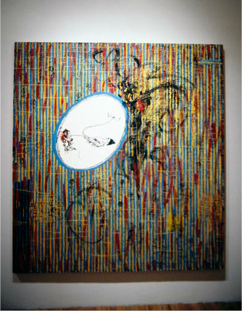 |
The primary color palette in an artwork
consists of the colors red, yellow, and blue. In easier terms, the
artist enjoys using these three colors to create their artwork. Jame
Hammond created an artwork called Untitled using
the colors red, yellow, and blue. Her artwork then becomes a primary
color palette. The entire background red, yellow, and blue vertical
lines intersecting. To create a contrast, she has a lite blue circle
drawn in with a smaller picture drawn in the center. Although there
is that contrast, the basis of the painting consists of the primary
colors in the color wheel so it demonstrates the idea of a primary
color palette.
|
Cross Hatching
 |
Cross
Hatching is used to create volume and space within a drawing. One
set of hatching is crossed by a different set of hatching at a
certain angle on the figure. Sometimes, an artist will use a third
or forth set of hatching to create what they are going for. The
closer the lines get to each other, the darker the area becomes.
Nude Woman, Kneeling by
Michelangelo is completed by
using cross hatching. It is demonstrated throughout her entire body
but is most clearly seen on her chest, stomach, and left thigh. The
cross hatching makes her look like she has volume or depth. As you
can see, in the spots with the most cross hatching, she is darker in
appearance than in places that have very little cross hatching like
on her right thigh.
|
Hatching
 |
Mary Cassatt's piece called The Map
demonstrates the technique called hatching. Hatching is when an
artists uses parallel lines within close proximity. The closer the
lines are to each other, the darker the area becomes. When looking
at The Map, you can
see that the picture is created strictly through parallel lines. The
wall that was drawn behind the people clearly shows hatching as it is
made of parallel lines. Another clear example of hatching is within
the children's hair. Both of their heads have straight hair because
the lines need to be parallel.
|
Saturday, June 15, 2013
Forshortening
 |
Foreshortening is
used to adjust an object so that it looks normal during the process
of distorting an artwork into a close up view. For example, if the
artist wanted to use this technique on a person, the whole body would
be painting shorter. In the painting Holy Family with Saint John
the Baptist and His Parents, the entire piece of work
demonstrates foreshortening. Andrea Mantegna painted the people so
that they could be viewed sitting down. If he didn't use this
technique, the people would have looked distorted. Instead, he
created them so that they are proportional but closer up.
|
Visual Overlapping
 |
Visual Overlapping makes an artwork
look like it is three dimensional. Overlapping makes the objects in
the picture look like they are in front or behind one another. 1947
by Steve DiBenedetto uses the
technique of overlapping. The gray rock shaped form clearly looks
like it is placed in front of the rest of the painting. The
different colors such as yellow, green, red, and orange are also
clearly in front of the blue background. One way to create this
technique to to paint an image bigger than the rest of the picture.
Anther way to do this is to make the audience feel like they are
looking down on the painting like in his artwork called Deliverance.
|
Friday, June 14, 2013
Expressive Lines
 |
Expressive
lines are produced by the artist. They can be wispy or completely
straight depending on what emotion the artist wants to recreate. For
example, Van Gough is famous for using wispy lines in his artwork
while Sol LeWitt is famous for using mostly straight lines. In
Jasper Johns Passage, he
uses straight lines. They seem more free flowing than rigid. He
uses this technique is a bunch of his different paintings included
the one mentioned in the textbook called Numbers in Color.
Jasper Johns demonstrates an expressive line through his free
flowing straight lines.
|
Contour Lines
 |
A
contour line is a detected line that demonstrates the border of an
object on a space. Henri Gaudier-Brzeska's Study of a
Small Boy shows the idea of a
contour line through the rough sketch of the image. Although this is
the final output of his idea, the sketch shows the border of the
small boy. It doesn't show a tremendous amount of detail. All it does is clearly define where the boy is located on the space.
|
Implied Lines
 |
An implied line is a line that is
created by a figure in a piece of art. It is a moving line is
established by someone pointing a finger or an angle of a building.
Madonna and Child, created by
Titan was created with an implied line built in. If you look at the
Madonna, her head scarf is painted so that it tips downward towards
the child. The implied line is created through the head scarf and
Madonna's head. It makes the audience focus on the child.
|
Outlines
 |
An outline a line that is drawn or
painted on the outside of a figure. Jaune Quick-To-See Smith's Hide
and Seek demonstrates what an
outline is. The outlines separate the trees and Indians from the
corn fields. This is a good example because there isn't a lot of
detail, but just enough to distinguish what each object is based on
the colors and outlines.
|
Saturday, June 8, 2013
Abstraction
 |
Abstraction
fits in between representational art and nonrepresentational art.
Abstract art is art that shows hits of realism but usually can't be
see by a person's eye. Clifford Possum Tjapaltjarri's Two
Dancing Men doesn't really tell
a story when you first look at it, but the realism behind it is
there. The two men are drawn in the center facing the circled ant
hill. There is a cow on the top to signify a farm. There are also
white feathers used to show a celebratory dance. All of these ideas
can be seen in a realistic world which makes the painting abstract.
|
Iconoclast
 |
Iconoclasts or “image breakers”
would destroy religious images because they thought it was a sin to
draw people on religious books. They believed in the commandment
against the worship of carved illustrations. Their life work was to
destroy all pictures to prevent artists from upsetting God. In the
textbook, they show a picture that has been destroyed. All of the
heads have been erased from the people in the picture. I found
another sculpture by Ai WeiWei called Perspective that
also has a damaged face. It is meant to display a man laying on his
back, but he has no arms, and his face is distorted. This sculpture
demonstrated iconoclast ideas because the face looks like it has been
destroyed. The entire body is rounded out and sculpted to look like
a human body except for the face. It is choppy and looks like it is
missing part of his head. This is why people are led to believe that
it has been destroyed.
|
Friday, June 7, 2013
Icons
 |
An
icon is used to speak powerful messages to the community through an
artist's work. They can be religious, political, or pop culture as
some examples. I used Jean-Michel Basquiat's In
Italian to
demonstrate how powerful an icon can be. For example, Basquiat uses
the symbol of a crown in many of his paintings. In In
Italian
he wrote out crown of thorns and then crossed out the word thorns.
He uses the symbol of a crown to demonstrate his own idea that he is
a king and also to similar
to the dreadlocks that he used to have (Book 7, n.d.). Another point
is that of all of the words on the canvas, not one of them is in
Italian so people try to understand why he named it In
Italian in
the first place. The reason for the name is that he spent a lot of
time in Italy selling paintings. He was once detained at the Italian
customs for have 100,000 dollars in cash on him. The main character
is supposed to resemble a picture of Christ from the Baroque era
which is why the crown of thorns is written over his head. As you
can see, Jean-Michel Basquiat has many different meanings all
combined into one painting (Seed, n.d.). This is why his In
Italian is
perfect to demonstrate how powerful an icon really is.
References
Book (7),
t. (n.d.). Jean-Michel Basquiat at Gagosian Gallery | New American
Paintings/Blog. New
American Paintings/Blog | Juried Exhibitions-in-Print.
Retrieved June 8, 2013, from
http://newamericanpaintings.wordpress.com/2013/03/25/jean-michel-basquiat-at-gagosian-gallery/
Seed,
J. (n.d.). John Seed: Jean-Michel Basquiat: 80 Percent Anger and 20
Percent Mystery. Breaking
News and Opinion on The Huffington Post.
Retrieved June 8, 2013, from
http://www.huffingtonpost.com/john-seed/basquiat_b_2750666.html
|
Nonrepresentational Art
 |
Nonrepresentational
Art is represented through an image that has no relation to the
natural or objective world. Beatriz Milhazes's Picabo
is a great example of nonrepresentational art. When you look at it,
it has no relation to anything that can be seen from your own eye.
The basis of Picabo
is
different
colored squares. Milhazes paints over the squares with different
objects such as circles and swirls. If you notice in the background,
she paints small hearts and flowers. These are the only parts of the
artwork that have any relation to the objective world. This makes it
very much nonrepresentational.
|
Representational Art
 |
Representational
Art shows natural images in a recognizable form. In other words, the
more it looks like what you would see thorough your own eyes, the
more representational it is. Albert Bierstadt's Sea
Cove
shows the ocean hitting the sand with a small land form with trees on
it in the background. He also shows how the land form slopes down
onto the sand with tree roots jutting out. There is seaweed on the
beach to show how far the tide comes up on the sand at different
times of the day. Sea
Cove is
extremely realistic which is the exact definition of Representational
Art.
|
Subject Matter vs. Content

 |
The subject matter of a piece of art is
defined by what the picture literally shows you while content is
defined by the meaning of the image. Yayoi Kusama's depiction of dots is great to use to demonstrate the difference between subject
matter and content because they are completely different on this
particular installation. As seen with Yayoi Kusama's artwork called
Narcissus Garden, the
subject matter is a room of
1,500 silver plastic balls that each reflect the person that is
standing in the middle of the room. The content of the piece is
meant to demonstrate how each person is simply a dot in the universe.
She wants to show people that they are a little piece of this giant
world by letting them see 1,500 reflections or “other people”
around. I found it interesting to see how different the subject
matter is compared to the content. When I first looked at the
picture I just saw someone laying in a sea of chrome balls, but after
completing my research I have found out that this artwork means so
much more.
References
Unknown,
A. (n.d.). A dot in the universe – Yayoi Kusama and the link
between self and other | Mutable Matter. Mutable
Matter | Interdisciplinary writing on representation, materiality and
agency.
Retrieved June 7, 2013, from
http://mutablematter.wordpress.com/2011/12/15/a-dot-in-the-universe-yayoi-kusama-and-the-link-between-self-and-other/
|
Thursday, May 30, 2013
The Meaning of Kitsch
 |
The Widow by
Frederick Dielman is kitsch because it shows a cat in a gaudy ruff.
Kitsch is described through
art by depicting a popular icon in something gaudy or different. It
stands out to you when you look at it. The Widow
stands out because it is a cat sitting in a ruff which is an
Elizabethan collar that women wore during that
time. So in other words, Dielman is using a cat to describe what this widow would look like instead of the woman that she really is.
|
The Meaning of Aesthetics
 |
Kane
Kwei creates unique coffins that can be extremely aesthetic. People
commission these coffins because they want to be buried in something
that sums up their life. This car coffin would be for someone that
drove or raced cars for example. He has also commissioned many
different coffins including a rooster for a farmer and a chilli
pepper for a restaurant owner.
|
Role of Being an Artist Rule 4
 |
Picasso's
Temple Gardens shows
how artists can give shape to their
personal feelings, and religious ideas. The
painting is meant to look like you are looking through a stained
glass window. Each stairway leads into another door of the unknown.
This stresses the idea of giving shape to what people imagine is in
those doors.
|
Role of Being an Artist Rule 3
 |
Renzo
Piano creates architecture that is self-sufficient and can be renewed
with resources that are friendly to the country that the building
is located in. This picture is of the Kansai International Airport
Passenger Terminal Building. The curves of the roof are seen from
the departure roads at the airport. This supports the idea that
artists can make buildings more functional, beautiful, and create
meaning to them.
|
Roles of Being an Artist Rule 2
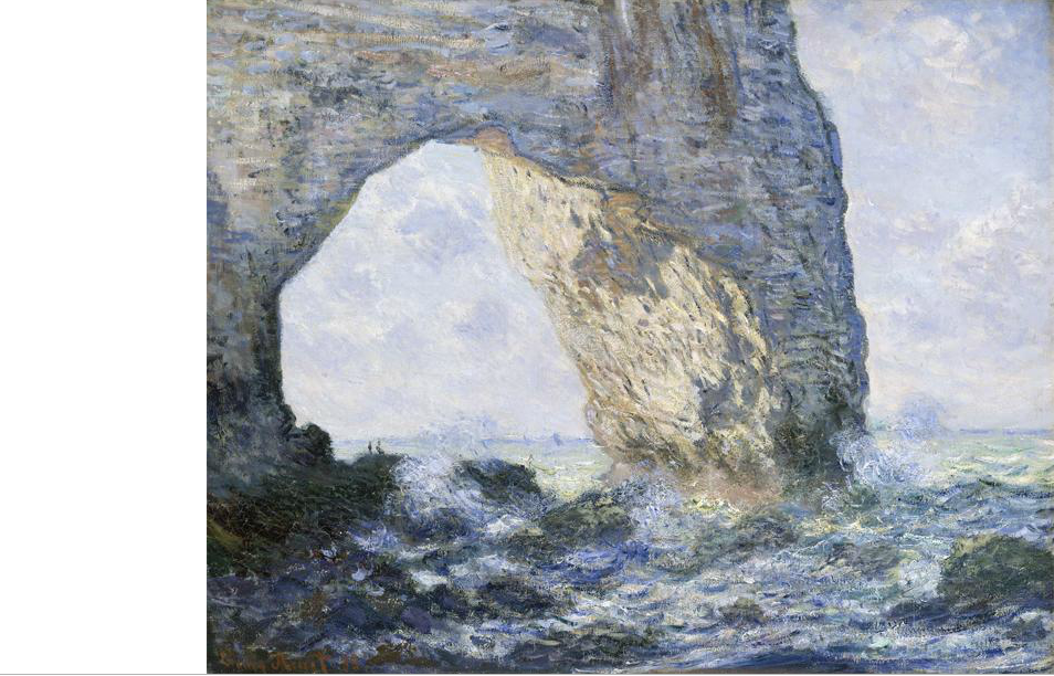 |
The Manneporte (Etretat) was
created by Claude Monet. It clearly demonstrates
the idea of how artists can make a visual masterpiece of the people,
places, and things that they have seen in their life. He used oil on
canvas to create a drawing of a cove that he had seen during his
life.
|
Roles of Being an Artist Rule 1
 |
The Bookcase Without Books was
created by Yayoi Kusama. This is a great piece of artwork to use to
describe how artists helps people to see the world in new and
different ways. As you can see, it is a sculpture that looks like it
has been made up of gloves. This is a different way to look at a
bookshelf because they normally aren't made of gloves.
|
Subscribe to:
Comments (Atom)